A company notifies its employees that emails will be automatically moved to a cloud-based server in 180 days. Which of the following describes this concept?
Correct Answer:
C
Which of the following is a non-parametric test?
Correct Answer:
D
The correct answer is D. Spearman??s rank correlation.
Spearman??s rank correlation is a non-parametric test that measures the strength and direction of the relationship between two variables that are ranked (ordinal) or continuous. Spearman??s rank correlation does not assume that the data follows a normal distribution or that the variables are linearly related. Spearman??s rank correlation is based on the ranks of the data rather than the actual values12
* A. One-sample t-test is not correct, because it is a parametric test that compares the mean of a sample to a specified value. One-sample t-test assumes that the data follows a normal distribution and has a known population standard deviation34
* B. Two-way ANOVA is not correct, because it is a parametric test that compares the means of two or more groups that are influenced by two independent factors. Two-way ANOVA assumes that the data follows a normal distribution, has homogeneous variances, and has independent observations.
* C. Correlation coefficient is not correct, because it is a parametric test that measures the strength and direction of the linear relationship between two continuous variables. Correlation coefficient assumes that the data follows a bivariate normal distribution and has no outliers.
A customer survey reveals 90% positive feedback. Which of the following statistical methods would be best to utilize to determine the reliability of a data set and predict how a larger sample of customers over the same time period might respond?
Correct Answer:
C
A low standard deviation in survey responses indicates that the data points tend to be close to the mean, suggesting a high level of consistency among the responses. This consistency is crucial for determining the reliability of the data set and predicting future outcomes. If the standard deviation is low, it means that the positive feedback is not only high but also consistent, making it a reliable indicator of customer satisfaction and a good predictor of how a larger sample might respond.
References: The concept of using standard deviation to assess data reliability is a standard practice in statistics and data analysis123.
Which of the following is a relational database?
Correct Answer:
A
A data analyst is designing a dashboard that will provide a story of sales and determine which site is providing the highest sales volume per customer The analyst must choose an appropriate chart to include in the dashboard. The following data is available: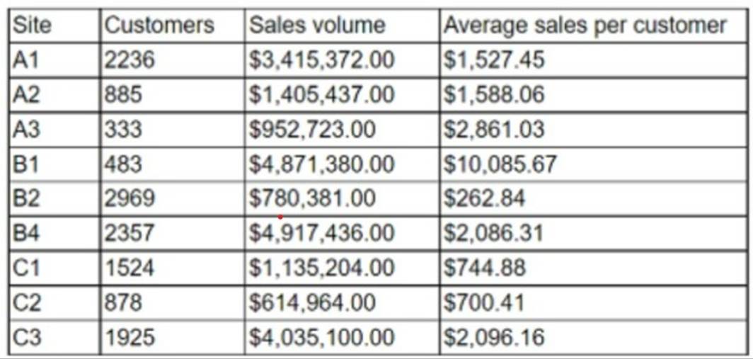
Which of the following types of charts should be considered?
Correct Answer:
D
The best type of chart to display the data is D. Include a column chart using the site and sales to average sales per customer.
A column chart is a good choice for comparing categorical data with numerical data, such as the site and sales to average sales per customer. A column chart can show the relative differences between the sites and highlight the site with the highest sales volume per customer. A column chart can also be easily labeled and formatted to make the data clear and understandable.
A line chart is not suitable for this data, because it is used to show trends or changes over time, which is not relevant for the site and sales to average sales per customer data. A line chart would also be confusing and misleading, as it would imply a connection or correlation between the sites that does not exist.
A pie chart is also not a good choice for this data, because it is used to show the proportion of a whole, not the comparison of different categories. A pie chart would also be difficult to read and interpret, as it would require labels or legends to identify the sites and their sales to average sales per customer. A pie chart would also not be able to show the exact values of the sales to average sales per customer, only their relative sizes.
A scatter chart is another inappropriate option for this data, because it is used to show the relationship or correlation between two numerical variables, not between a categorical and a numerical variable. A scatter chart would also be cluttered and unclear, as it would plot each site as a point on a coordinate plane, without any labels or axes. A scatter chart would also not be able to show the differences or rankings between the sites and their sales to average sales per customer.