Which of the following are compelling reasons to use a Stacked Bar Chart?
Correct Answer:
AC
Stacked bar charts will usually have lesser number of bars compared to a normal bar chart:
Normal bar chart - 9 bars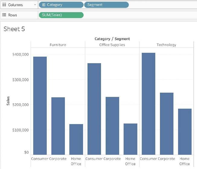
Stacked Bar Chart - 3 bars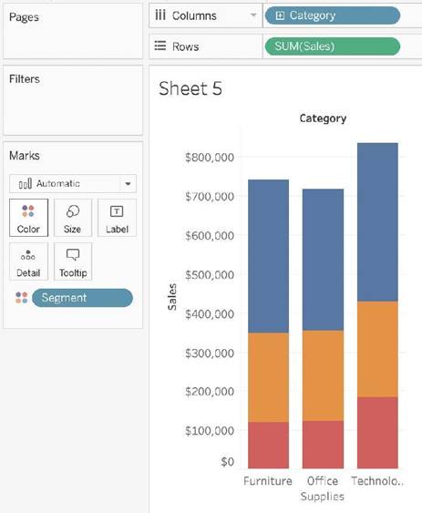
We can easily see a 'part-of-a-whole' methodology being used here as well - we are seeing the breakdown of Segments within each Category.
To easily visualize trends over time - This is the definition of a line chart.
To visualize each discrete category using a separate bar - This can be accomplished using a simple bar chart, why use a stacked one?
What is a story point in Tableau?
Correct Answer:
A
In Tableau, a story is a sequence of visualizations that work together to convey information. You can create stories to tell a data narrative, provide context, demonstrate how decisions relate to outcomes, or to simply make a compelling case.
A story is a sheet, so the methods you use to create, name, and manage worksheets and dashboards also apply to stories (for more details, see Workbooks and Sheets). At the same time, a story is also a collection of sheets, arranged in a sequence. Each individual sheet (worksheet or dashboard) in a story is called a story point.
When you share a story —for example, by publishing a workbook to Tableau Public, Tableau Server, or Tableau Online—users can interact with the story to reveal new findings or ask new questions of the data.
Reference: https://help.tableau.com/current/pro/desktop/en-us/stories.htm
How can you MANUALLY assign geographic roles to a dimension from the data pane?
Correct Answer:
B
From the data pane, simply right click on the dimension, choose geographic role, and then select the appropriate role as follows: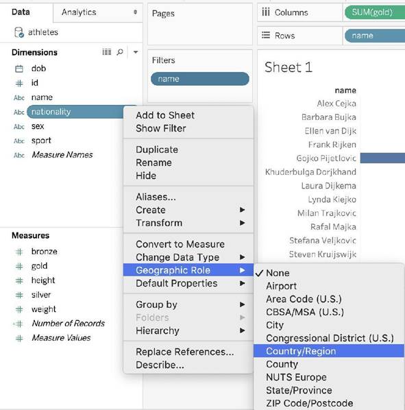
Are animations enabled by default in Tableau?
Correct Answer:
A
No, by default, animations are not enabled in Tableau.
We can animate visualizations to better highlight changing patterns in your data, reveal spikes and outliers, and see how data points cluster and separate.
Animations visually transition between filter, sort, and zoom settings, different pages, and changes to filter, parameter, and set actions. As visualizations animate in response to these changes, viewers can more clearly see how data differs, helping them make better informed decisions.
When you author animations, you can choose between two different styles: simultaneous or sequential. Here are examples of each type.
1) Simultaneous animations
The default simultaneous animations are faster and work well when showing value changes in simpler charts and dashboards.
2) Sequential animations
Sequential animations take more time but make complex changes clearer by presenting them step-by-step.
To Animate visualizations in a workbook:
1) Choose Format > Animations.
2) If you want to animate every sheet, under Workbook Default, click On. Then do the following:
For Duration, choose a preset, or specify a custom duration of up to 10 seconds.
For Style, choose Simultaneous to play all animations at once or Sequential to fade out marks, move and sort them, and then fade them in.
3) To override workbook defaults for a particular sheet, change the settings under Selected Sheet.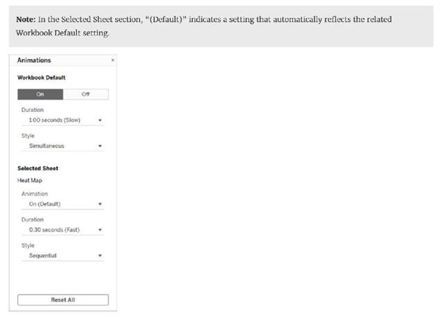
Reference: https://help.tableau.com/current/pro/desktop/en-us/formatting_animations.htm
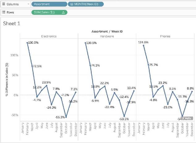
Using the Time Series Table, create a Line chart showing the Monthly Year over Year Growth for the Sales, broken down by Assortment. For the Electronics assortment, which Month had the most NEGATIVE value of Year over Year Growth?
Correct Answer:
A
Follow along:
1) Drag Assortment and Year ID (choose Discrete Month) to Columns shelf, and Sales to the Columns Shelf.
For sales, click on the pill -> choose Quick Table calculation -> Year over Year growth.
The view should now look like: